
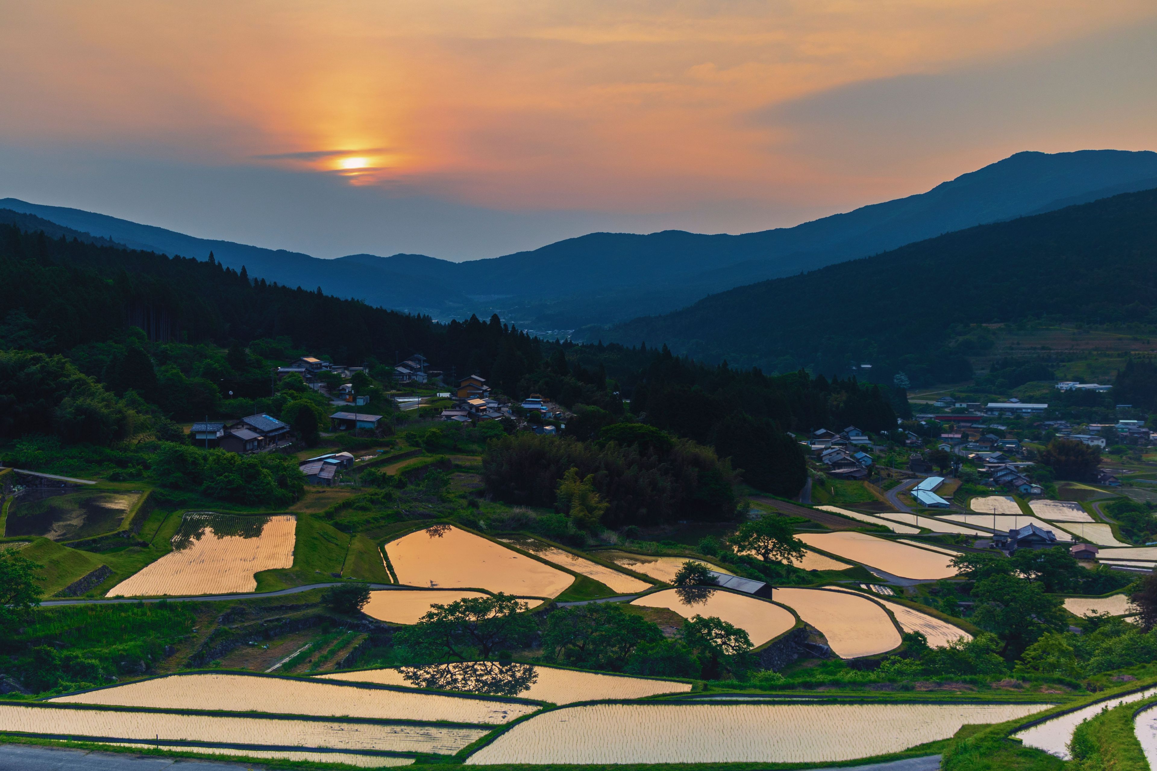
In September I went to Gifu to meet Ayami-san from Japan Rural Tours. I'd spent a long stretch in Japan's cities, and I wanted to see what the countryside could teach me about design.
What I brought back was mostly about colour, and about how much an image can say before anyone has read a word. That matters to anyone taking a brand from the UK to Japan, because the meaning of a colour or an image doesn't always travel with it.
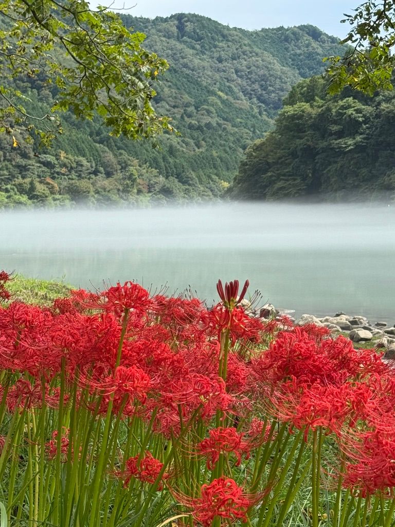
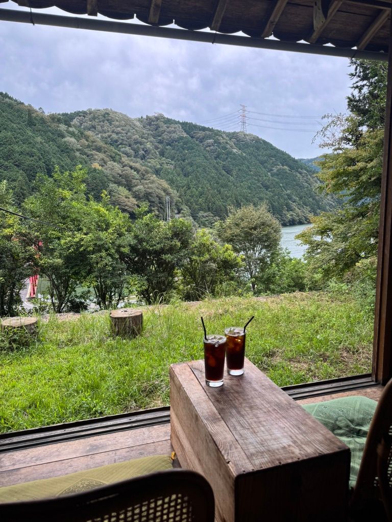
Red spider lilies by the Kiso River
We visited the Kiso River, where the red spider lilies were in bloom. Known in Japanese as 彼岸花 (higanbana), they're traditionally linked with death and the afterlife, and they are often planted near graves. They flower around the autumn equinox, the time of year when many families visit their ancestors' graves.
Gifu was recently used as the backdrop for the horror game Silent Hill f, whose fictional town is based on Kanayama in Gero, and these flowers play an important role in the story.
It's a good reminder that imagery from nature often carries meaning beyond how it looks, and that the same flower can say something quite different depending on who's seeing it. To most British visitors a riverbank of red flowers in September is simply beautiful, whereas to many Japanese people it also brings the dead to mind, which is exactly why a horror game reaches for it.
For a brand, that gap is the whole problem. An image chosen because it looks right in London can carry an association in Tokyo that nobody on the London team would think to check.
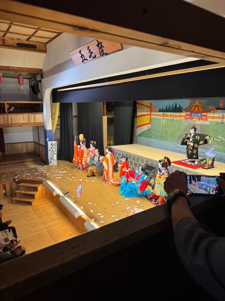
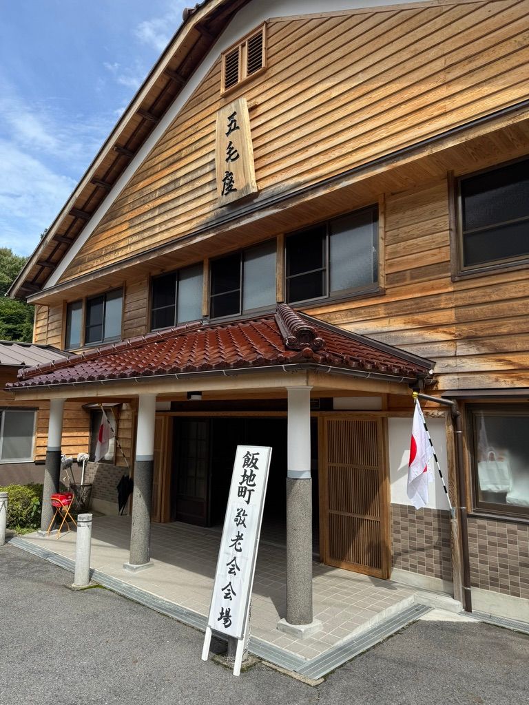
Children's kabuki: colour against plain wood
The trip had started with something you don't see often: children's kabuki. It's a form of 地歌舞伎 (ji-kabuki), the local kabuki that towns across rural Gifu have kept alive for generations, and the prefecture is the most active region for it in Japan. The kids were very good, and the costumes were beautiful.
What I always come back to is the colour: bold, patterned costumes against the plain, weathered wood of the theatre. The wood doesn't compete, and that's why the colour works.
A website works the same way. When every part of a page is asking for attention, nothing gets it, whereas a quiet frame lets the product, the photography or a single accent colour carry the brand. It also means that when a colour has to change for a new market, the change only has to happen in a few places, because the rest of the page was never relying on it.
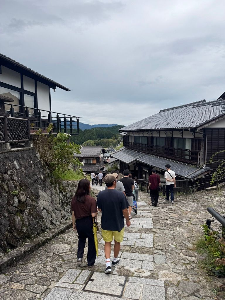
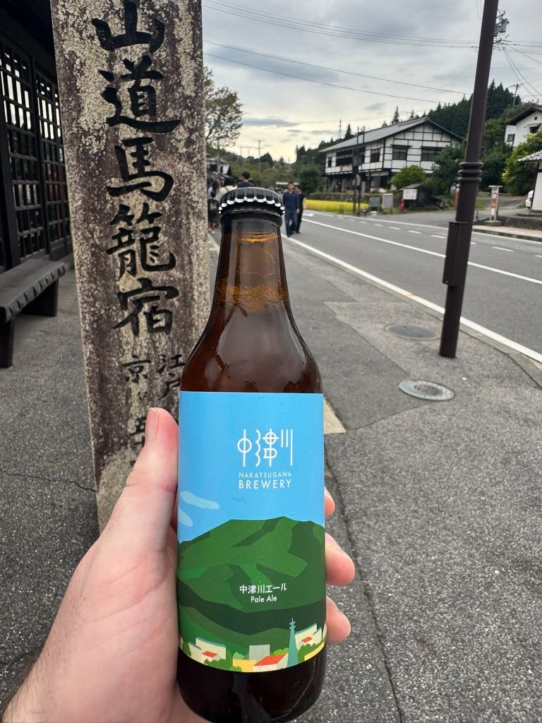
The Nakasendo and a light-blue bottle
I also spent a day hiking a stretch of the 中山道 (Nakasendo), the historic route that linked Edo (now Tokyo) and Kyoto during the Edo period. At the end of the walk I grabbed a beer from Nakatsugawa Brewery, and I loved the design.
It captures the surrounding countryside, and the light blue told me I was about to be refreshed before I'd even opened it, which is a lot for a design to say before you've read a word.
The brewery only began selling its own beers in July, and it has built the brand around Nakatsugawa's nature, history and culture. Colour is doing much of that work, and light blue reads as fresh and cool to a British drinker as well, so this is one of the cases where the meaning travels intact. Knowing which colours carry across and which don't is most of what visual localisation comes down to.
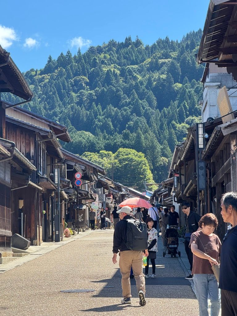
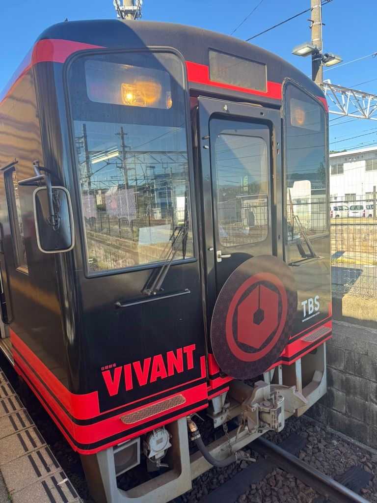
Iwamura and VIVANT: when a story changes what a place means
We then headed to Iwamura Castle Town, usually a quiet place but currently busier than it's used to, after the spy drama VIVANT filmed there. The town has made the most of the 'drama tourism' it has attracted.
Plenty of the shops were selling VIVANT and VIVANT-inspired goods. It was a good example of how quickly a story can change the way people see a place, and how readily a town with centuries of history will rebrand around it.
The spider lilies and Iwamura are two versions of the same thing. The flower's meaning was built up over centuries of custom, while Iwamura's new one arrived with a single television series, but in both cases the meaning comes from the stories people bring with them rather than from the thing itself. When you take a brand into Japan, you're stepping into stories your audience already knows and you might not.
What this means if you're taking your brand to Japan
When we localise a site for Japan, the words are only part of the job.
In our view, the point isn't that a UK brand has to change its colours for Japan, and usually it doesn't. It's that someone who knows both markets should look at every image and colour choice and ask what it says to the person seeing it, as well as what it meant to the team who chose it. It's the same job as translating ideas instead of words, done with pictures.
Up to the castle
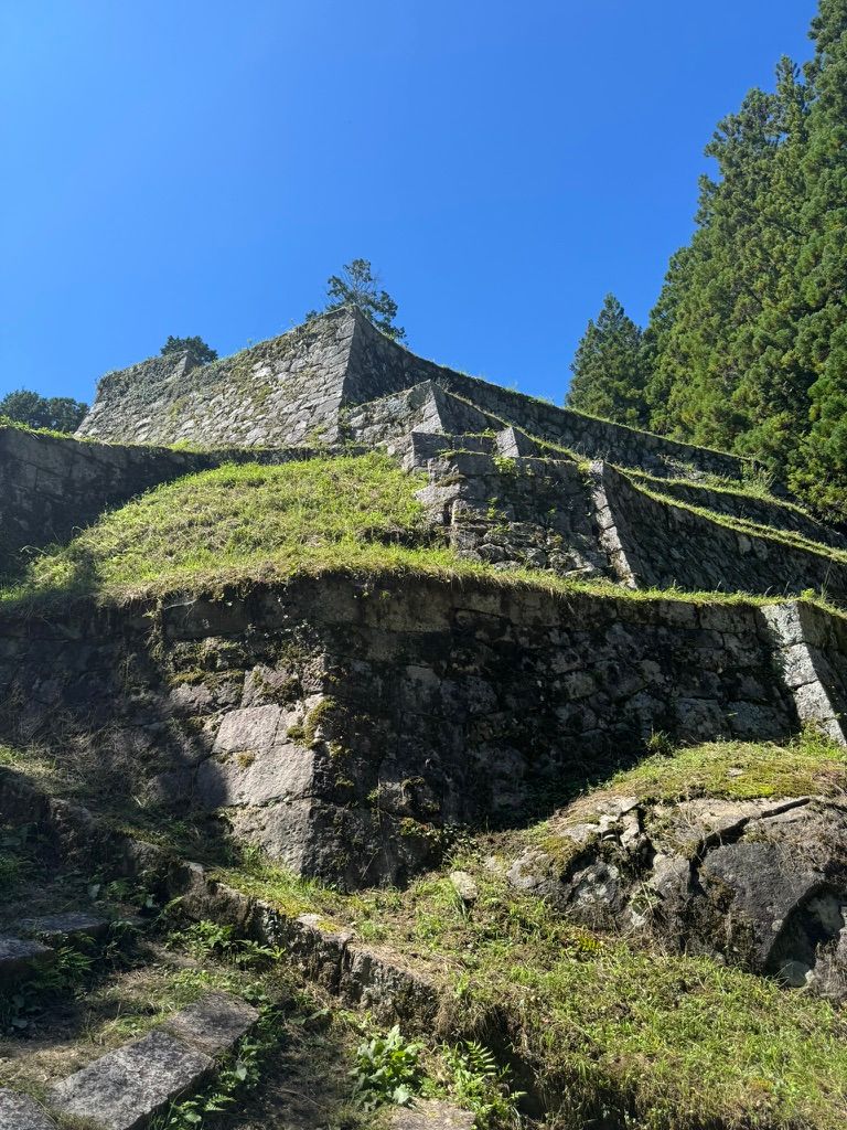
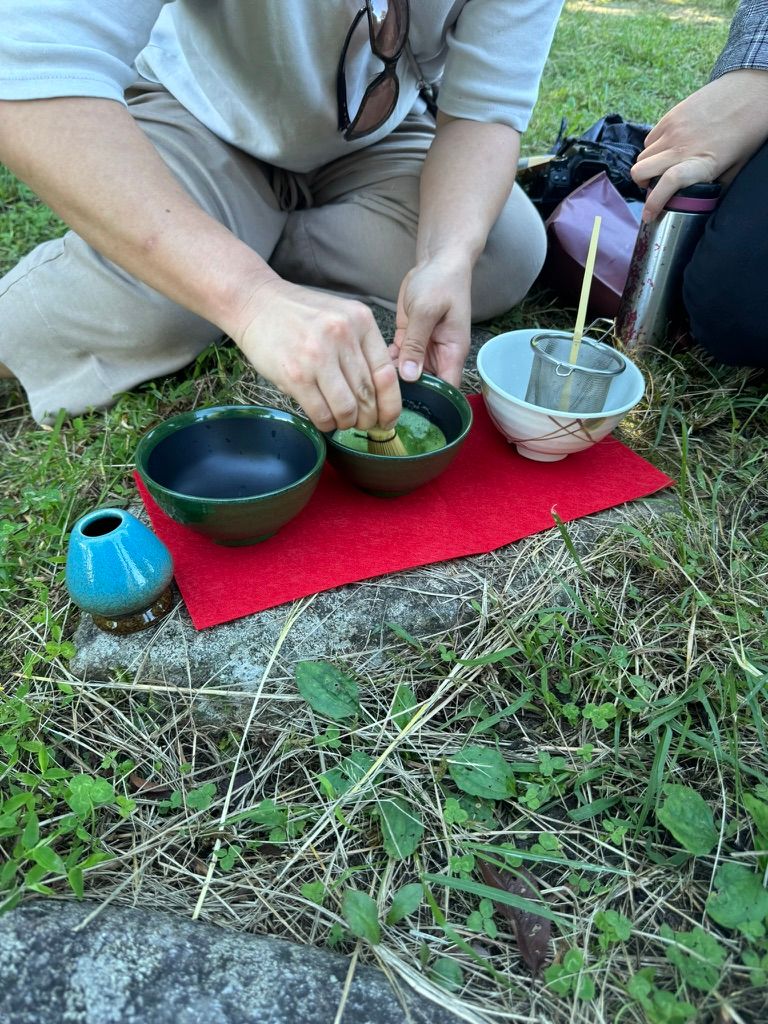
Finally, we headed up to the castle itself, a short climb to the top with a beautiful view over the town. To finish, Ayami-san made us traditional matcha (not matcha lattes, much to her son's disappointment) before we started the walk back down.


